Beautiful Buttons and the Glass Effect: How to Make an Interface Look Expensive
Why one button looks like a million bucks and another looks like it came out of a 2008 tutorial
How to make a beautiful button and the liquid glass effect: shape, soft shadow, border, hover and active states, background blur. Plus ready-made briefs for the AI.
In plain words: why a button looks expensive
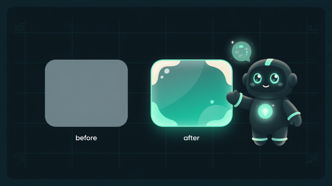
Know that feeling? You land on one site and everything begs to be touched, everything breathes. You open another — same buttons, same blocks, but it feels like you wandered onto a forum about fixing washing machines. It’s not about budget, and it’s not about some secret plugin. It’s about a dozen tiny things. One at a time you barely notice them, but together they create that unmistakable “made with love” feeling.
A button is the most honest indicator of taste. A little rectangle with nowhere to hide. You can tell instantly: did the author think about the details, or just flood a gray square with color and move on?
Why you should know this if you’re vibecoding an interface
You tell the AI “make a beautiful button” — and you get something middling. Neither here nor there. To fix the result, you need to be able to name in words exactly what’s missing. Otherwise you’re stuck playing the “just make it a bit better somehow” role, and honestly, that’s not a command.
- You’ll be able to diagnose why someone else’s interface (or your own) looks cheap, and fix it precisely instead of by guesswork.
- You’ll learn to write a clear brief: not “prettier”, but “add a soft shadow, a hover with a slight lift, and a thin border along the edge”.
- You’ll understand the trendy glass effect from the inside — and stop slapping it everywhere. And everyone’s slapping it on everything right now.
- You’ll train your eye. After this lesson you’ll start noticing details that used to slip right past you.
Nine out of ten “ugly” buttons aren’t a matter of bad color. It’s harsh shadows, zero reaction to the cursor, and a dead, instant transition with no animation.
What makes a button “expensive”: layer by layer
Each layer is small. But remove one and the whole picture falls apart. Let’s go in order.
Button shape: corner rounding and proportions
Sharp 90-degree corners almost always look crude and dated. A slight rounding makes a button friendly and modern. There’s one catch: the rounding should be intentional — either neatly soft, or honestly round (a pill). The in-between “a little bit, by eye” usually looks accidental.
Next — the air inside. The text shouldn’t crowd the edges. The side padding should be noticeably larger than the top and bottom. That’s a basic sign of a button made with thought.
Button shadow: a hint of height, not a blob
A shadow isn’t there “just because”. It tells the eye one thing: the button is lifted above the background, it can be pressed. And the classic beginner mistake here is a hard, dark shadow pressed right up against the button. Light just doesn’t fall that way in the real world, and the eye feels it immediately.
- Soft and heavily blurred — the edges dissolve instead of being chopped off with a knife.
- Offset downward more than to the sides — as if light is falling from above.
- Translucent and tinted toward the background, not pure black.
- Sharp, with no blur — looks like a sticker with an outline.
- Black and dense — a dirty smudge under the button.
- Huge and spread in every direction — the button seems to float in space.
Button border: the thin line that makes the difference
A border A border is a thin line along the edge of an element. On buttons it's often made translucent or slightly lighter than the button itself, to separate it from the background without weighing it down. is the most underrated technique. A thin, one-pixel, slightly light line along the top edge imitates a glint of light and adds depth to the button almost for free. And a translucent border around the whole perimeter neatly separates the button from the background when there’s little shadow. A small thing? Yes. But it’s exactly these small things that everything is built from.
Hover and active states: where a button comes alive
A static button is dead. What makes it alive is its reaction to you. At minimum — two states:
- Hover Hover is the state when the cursor is over an element but the button hasn't been pressed yet. Usually you change the brightness or the shadow, and sometimes lift the element a touch. (you move the cursor over it) — the button floats up a bit: it gets lighter or the shadow grows slightly. As if it leaned toward you.
- Active Active is the state at the moment of the click, while the button is held down. It's usually pushed in a little: the shadow shrinks and it shifts down a couple of pixels. (you press it) — the button sinks: the shadow shrinks, and it drops a couple of pixels. Like a real physical key under your finger.
Liquid glass: the glass effect that’s back in fashion
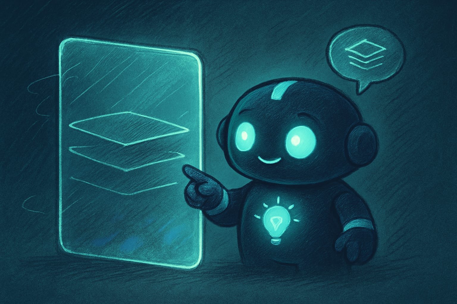
Liquid glass Liquid glass is an interface style with translucent, blurred elements that look like frosted glass over a background. Apple popularized it in its systems, but the idea itself is old — it's long been known as glassmorphism. is a frosted-glass effect: the element is translucent, and everything beneath it is blurred, as if you’re looking through a fogged-up window. After this style showed up in Apple’s latest systems, people started slapping it on literally everything. And often — completely out of place.
What the glass effect is built from
Glass needs three things at once, otherwise it doesn’t read:
- Blur of what’s beneath it (a blur In glass, it's not the element itself that gets blurred but the background behind it. On the web, the backdrop-filter property handles this. The blur is exactly what creates the frosted-glass effect. of the background). This is the “frostiness”. Without it, glass turns into an ordinary translucent rectangle.
- A translucent layer on top. A light fill that the blurred background shows through. Not fully transparent and not dense — somewhere in between.
- A thin light border and highlight along the edge. This is the “thickness of the glass”. The edge highlight is exactly what separates real glass from a murky smudge.
Where glass fits, and where it only hurts
Glass is a technique for upper layers: floating panels, menus, pop-up cards, navigation over content. Anywhere an element honestly sits on top of something. But making your main action buttons glass is a risky idea: transparency drops the contrast, and the text easily becomes unreadable. Keep the primary button solid. Give the glass to secondary elements — that’s where it belongs.
Ready-made briefs for the AI: button and glass
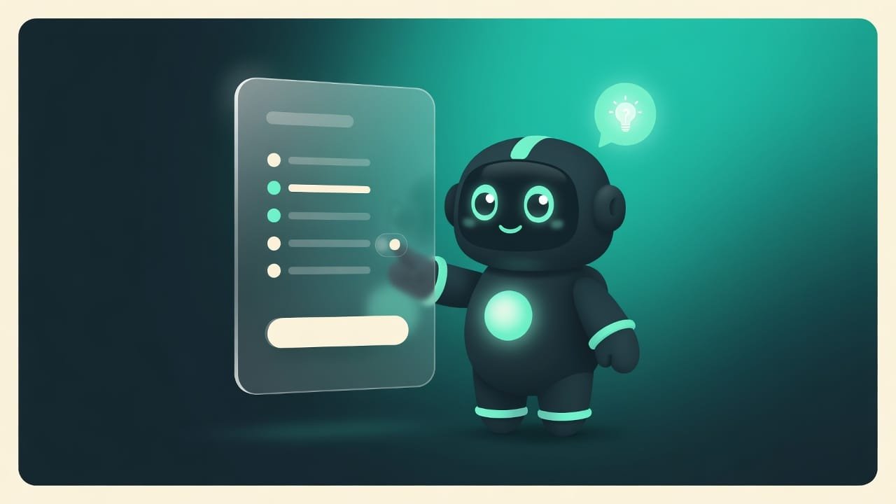
You don’t have to dig into the code by hand. But keeping a checklist in your head — that’s useful: it lets you clearly tell the AI what you want. Here are two ready-made briefs. Grab them and try.
Make the button expensive and modern. Slight corner rounding. Side padding noticeably larger than vertical. A soft, heavily blurred, translucent shadow offset downward, not black. A thin light border along the top edge for depth. Hover state — the button floats up a little, gets lighter, the shadow grows. Pressed state — it sinks in a bit, the shadow shrinks. All transitions smooth, in a fraction of a second, with no abrupt jumps.
Make a panel in the liquid glass style. Beneath it there should be a lively background — a gradient or a photo, not a solid color. A blur of the background under the panel — the frosted-glass effect. On top — a translucent layer of medium density. A thin light border along the edge and a gentle highlight along the top edge, imitating the thickness of the glass. A soft shadow below, so the panel reads as lifted. Keep the text inside contrasting and readable.
Common mistakes when styling buttons and glass
- A sharp black shadow pressed right against the button. Looks like a sticker. Blur the shadow and make it translucent.
- Dead states. The button doesn’t react to the cursor at all. Add at least a light hover — that’s half the “expensive” feeling.
- Instant transitions. The state changes in a jolt. Any change should be smooth, otherwise everything looks cheap.
- Glass on a single-color background. Nothing to blur, no effect. Glass needs a lively background beneath it.
- Overdoing all of it at once. Huge shadows, acid gradients, everything blinking. Restraint reads as expensive, not the number of effects.
- A glass primary button with pale text. Transparency kills contrast. Keep important elements solid and readable.
TL;DR - если коротко
- An expensive button is the sum of small things: shape, soft shadow, thin border, living states. On their own you barely notice them. Together — wow.
- A shadow isn't a black blob, it's a hint that the button can be pressed. Soft, blurred, nudged slightly downward.
- Hover and active are the soul of a button. Hover and it floats up, press and it sinks in. Without that, it's just a picture.
- Liquid glass = background blur + a translucent layer + a highlight along the edge. On a flat fill, glass dies — there's nothing to blur.
- Restraint wins. Soft shadows, tiny movements. Overdoing it always reads as cheap.
- Don't dive into the code. Just name the techniques in words in your brief — and the AI will do exactly what's needed instead of “something kind of pretty”.