Why AI Design Looks Generic and How to Fix It
Purple gradient, centered text, and three emoji in a row - where the cheap look comes from and how to cure it
Why AI-built sites look the same and cheap: the default gradient, a faceless font, centered text, emoji. Plus 4 principles of taste that fix it.
In plain terms: why every AI site has the same face
Ask any AI to “make a beautiful modern landing page.” Nine times out of ten you get the exact same site back. A purple-blue gradient up top. A centered headline. Below it - three identical cards with a rocket emoji, a lightning emoji, and a shield emoji. A “Get Started” button. You open it and you feel it right away: cheap. Like getting a plastic cup instead of a real glass one.
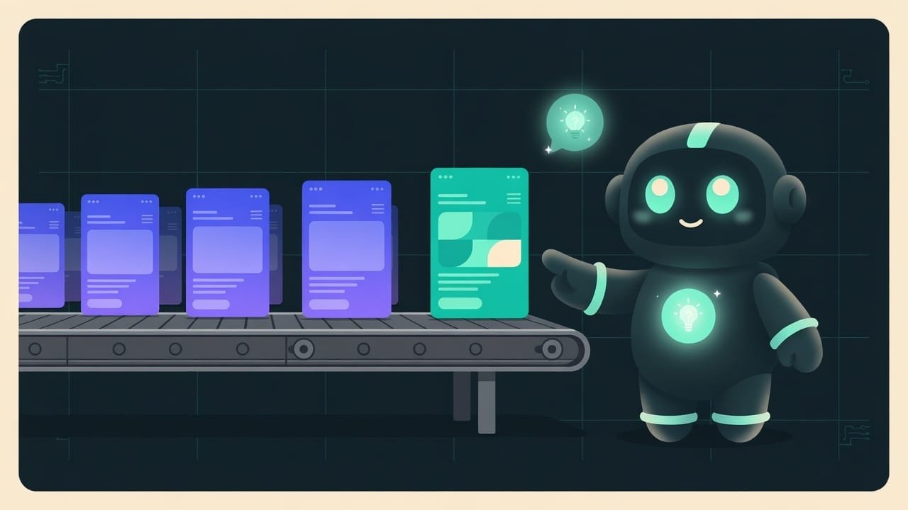
Why does this happen? Picture this: you dumped a thousand random sites into a hat and pulled out the “average” one. It won’t be terrible, and it won’t be beautiful. It’ll be the most ordinary - because it’s assembled from whatever shows up most often. AI does exactly that. It has seen millions of pages and hands you the average - not the best, just the most common. And the average of the internet is precisely that template.
Why you need to be able to strip out the “AI fingerprint”
You vibecode a site. It generates in a minute - and looks like one more drop in the ocean of identical landing pages. The client looks at it and thinks: “a neural net slapped this together.” Trust drops. And so does the price of your work.
- You’ll learn to spot the “AI fingerprint” at a glance and erase it.
- You’ll understand that taste is not an innate gift but a few simple rules you apply by hand.
- You’ll give the AI precise instructions instead of “make it pretty” - and get your own style instead of a cliché.
- You’ll stop drowning among a million identical sites and start standing out. And standing out means selling.
It’s not about “weak AI.” Give that same AI a concrete direction and it’ll nail it. The problem isn’t the tool. The problem is that nobody told it what they wanted.
Signs of the template: how to spot AI design at a glance
AI is an averaging machine Averaging - the model trained on a huge pile of existing sites and outputs the statistically most common option. Not the best one, just the most widespread. That's why the results all look alike. . Ask for a “modern site” with no details and you get the most common thing the model has ever seen. Here are its signature tells. Memorize their faces - soon you’ll be spotting them on autopilot.
The purple-blue gradient - tell number one
The most recognizable mark of AI design. That fade from purple to blue - on a background or on a button. It shows up so often that your brain reads it instantly: “template.” And it’s not that the gradient is bad in itself. It’s that this particular fade has been seen by everyone already.
A faceless font and centered text
A smooth font with no character - and all the text aligned to center. A centered headline is fine. But when the headline, a three-line paragraph, a list, and the captions are all centered, the page loses its spine. It’s hard to read. It looks like a slideshow from the 2000s.
Emoji instead of icons and the eternal three cards in a row
Rocket, lightning, shield, checkmark - emoji playing the role of icons. Different colors, different styles, each pulling in its own direction. Plus the immortal “three cards in a row” block: three features, three pricing tiers, three benefits. Not because you happen to have exactly three. Because that’s what the template does.
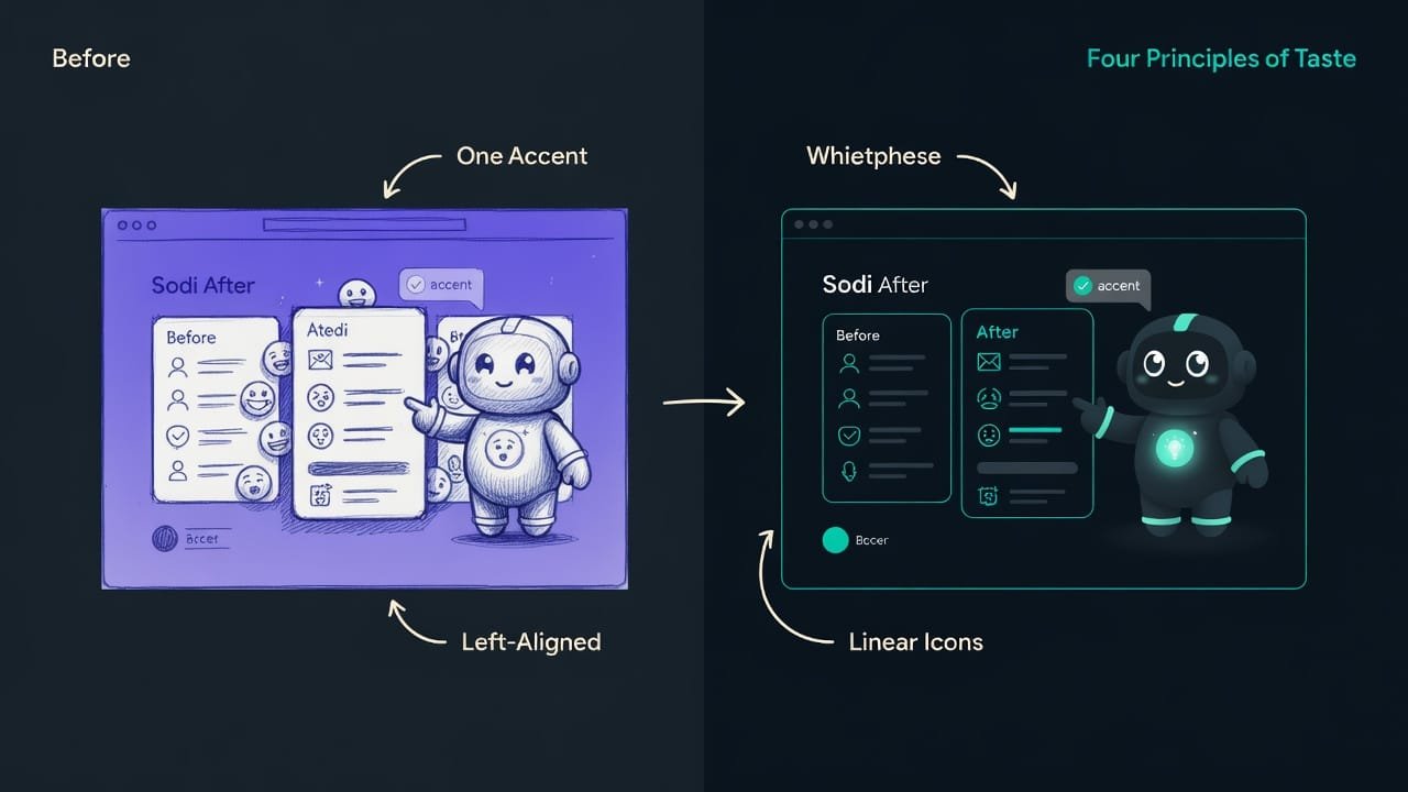
How to remove the generic look: four principles of taste
Taste is not magic and not a gift of the chosen few. It’s four rules that work almost every time. Apply them in order.
1. One accent - highlight only the main thing
There should be one main action on the screen - and only it burns with a bright color. Mute everything else. When everything “shouts” at once - a bright button, a bright banner, a bright badge, a bright icon - the eye can’t tell where to look. The page turns into a fairground.
The rule is simple. Decide what the person should do on this screen - and make only that bright. Leave secondary buttons calm, with no fill.
2. Your own palette instead of the default gradient
Walk away from the “default” gradient. Take one accent color plus a couple of neutrals - a dark or light background and one or two shades of gray. That’s enough for the whole site. Color is the voice of the brand. Even one non-standard shade instantly moves the site away from “a neural net slapped this together.”
- One accent color for everything - buttons, links, highlights.
- A couple of neutrals: background and text. Gray is your friend.
- Color is dosed like a spice, not poured as fill onto every block.
- The default purple-blue gradient - everyone has seen it.
- Five bright colors at once: every block its own color.
- Rainbow emoji that drag the palette into chaos.
3. Whitespace - empty space that works
Whitespace Whitespace is the empty space around elements and between them. It isn't 'idle': it groups things, sets accents, and gives the eye a rest. The more expensive a site looks, the more whitespace it has. is the empty space around text and blocks. A beginner fears emptiness and crams it full. Yet whitespace is exactly what makes a site look expensive. Give the headline room above and below. Don’t jam blocks right up against each other. And don’t center everything: long text reads left to right - align it to the left edge and give the page a spine.
4. Details - taste lives in the little things
The little things. On their own you don’t notice them, but together they create that “made by a human” feeling.
- Consistent spacing. One step of distances across the whole site (for example, everything a multiple of eight), not “a little here, a bit more over there by eye.”
- Typography. Proper curly quotation marks “ ”, an en dash instead of a hyphen where it belongs, no more than two fonts, a readable line length.
- Icons instead of emoji. One set of line icons in a single style - and the block instantly looks put together.
A real-life example: fixing a prompt in a minute
The fastest cure is to stop asking “make it pretty” and name the direction. Compare two prompts for the very same landing page. The gap between them is the whole chasm between a cliché and style.
Make a beautiful modern landing page for an app. Add a gradient, icons, and a benefits block.
Make an app landing page in a calm style. Palette: dark background, one teal accent color, everything else neutral gray. No gradients. One main call to action, only it bright, the second button calm with no fill. Align text to the left edge, not centered. Lots of whitespace between blocks. Line icons in a single style instead of emoji. One font, spacing in multiples of eight.
Common beginner mistakes in AI design
- Asking to “make it pretty.” For an AI that’s an empty phrase - it’ll substitute the most common thing, which is the template. Name the direction and the constraints.
- Leaving the default gradient. The first tell people use to spot a neural net. Replace it with one color or a flat background.
- Centering everything. Centered - a short headline. Paragraphs and lists - to the left edge, otherwise the spine is lost and it’s hard to read.
- Emoji as icons. Mixed styles, mixed colors - they cheapen the block. Take one set of line icons.
- Fearing emptiness. A screen crammed to the brim looks cheap. Whitespace isn’t wasted space, it’s a sign of expensive design.
- Throwing in bright colors. When everything shouts, nothing does. One accent, mute the rest.
- Changing everything at once. Fix one tell at a time, or you won’t know what worked. Start with the accent and the gradient.
TL;DR - если коротко
- AI gives you not the prettiest thing but the most probable one - an average of the whole internet. That's why every site looks alike.
- Telltale signs of the cliché: a purple-blue gradient, a faceless font, everything centered, emoji instead of icons, three cards in a row.
- One accent - highlight only the main action. Mute the rest, and the eye instantly knows where to look.
- Your own palette - one accent color plus a couple of neutrals. The default gradient goes in the trash.
- Whitespace - empty space isn't idle, it's working. Stop centering everything.
- Details - taste lives in the little things: consistent spacing, decent typography, icons instead of emoji.