Living backgrounds and gradients: how to bring a site's background to life
So the background breathes instead of sitting there like a slab of concrete
Living backgrounds and gradients for your site: radial glow, mesh gradient, slow motion, and grain. How to bring a background to life without overdoing the effects.
What a living background is, in plain terms
Open any boring page. Bet the background is one solid color, right? Not ugly. But it doesn’t grab you either. Like a room with white walls and a fluorescent ceiling light: livable, but you want to leave fast.
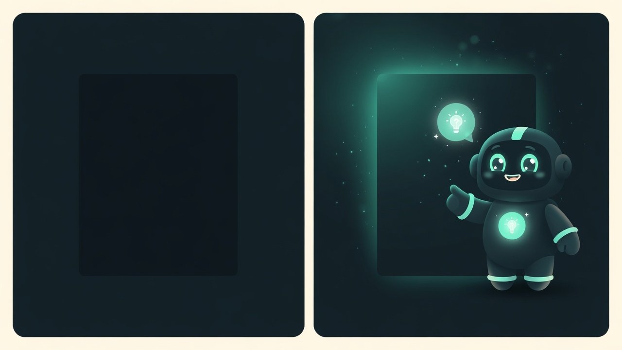
Now put a warm floor lamp in the corner of that same room. The light pools softly across the wall, the far corners go a little darker, the texture of the wallpaper is just barely readable. Nothing shouts - but it’s a pleasant place to be. That’s exactly what a living background is: it doesn’t paint a picture, it sets a mood behind the content.
And here’s the good news. All of this comes down to a couple of tricks - no heavy images, no full-screen animations.
Why bring a page background to life at all
You can leave the background flat. The page will be ‘fine.’ Trouble is, ‘fine’ gets forgotten in a second, while a living background keeps working for you the whole time someone is reading.
- Depth for almost free. A gradient weighs next to nothing and won’t slow the page down - unlike a background photo that’s a couple of megabytes.
- Mood without words. A warm glow, a cold haze, a neon blob - the background sets the tone before the first line is even read.
- Fewer ‘dead zones.’ Big empty stretches of screen stop looking like something unfinished.
- No more fear of overdoing it. An ugly background isn’t born from too few effects - it’s born from too many. Once you find the right measure, the background is always a plus.
Nine out of ten ‘off’ backgrounds aren’t a shortage of tricks - they’re a glut of them: three animations, an acid gradient, and grain cranked to the max. Restraint is worth more than imagination here.
What a living background is made of: four layers
Radial glow - like a lamp in the corner
The cheapest way to bring a flat surface to life is to throw a radial gradient A radial gradient is a color transition that radiates in a circle: a bright center that smoothly fades toward the edges. Unlike a linear gradient (a band running left to right), it gives the effect of a pool of light or a soft light source. onto it. One soft, light blob that gently dissolves into the main background color.
The whole secret is in the feathering. A sharp blob hits you like a flashlight in the face. But a very blurred one, fading to zero at the edges, reads like sun behind a cloud. Set the source outside the visible area, in a corner or just beyond it, so only the ‘tail’ of the glow shows.
Mesh gradient - a layered background of colored blobs
Stack several radial blobs of different colors on top of one another, and they blend into smooth transitions. That’s a mesh gradient A mesh gradient (mesh = a net) is a background made of several colored blobs layered together. Their soft edges flow into each other, giving the feel of a living, uneven surface instead of a flat band. - that ‘juicy’ background you see on modern landing pages.
The trick here is in the count. The proven sweet spot is about four to six blobs. Fewer looks thin. Noticeably more and the image turns to mud, and on weaker devices the page starts to stutter. Use two or three related colors plus one accent. Not a rainbow.
- Big empty screens: a hero block, a placeholder, the background behind a form.
- Dark theme: on dark, the transitions look richer and softer.
- Related colors plus one accent - a calm, expensive-looking palette.
- Under a long article text: the transitions get in the way of reading and tire the eye.
- Contrasting ‘acid’ colors right next to each other - mud at the seams.
- Too many blobs - lag and visual noise instead of beauty.
Gentle motion - so the background breathes instead of twitching
Moving the background is a powerful trick. And it’s exactly where people overdo it most. The rule is short: slow and barely noticeable. A glow that drifts unhurriedly across the screen over tens of seconds adds life. The same animation in a couple of seconds is annoying and yanks attention onto itself.
Grain and noise - a pinch of texture
A smooth gradient can look ‘plastic.’ It can also develop ugly bands Banding is the visible step-bands on a smooth gradient. It happens when there aren't enough shades for a smooth transition. A little grain breaks up the bands and hides them. where there weren’t enough shades for a smooth transition. The cure is grain: light noise over the background, like a film dusting. It kills the digital sterility and masks the banding.
The dose decides everything. Grain should be felt, not seen. Can you spot the noise at first glance? Then there’s many times more of it than you need. It’s usually laid on as a thin, semi-transparent layer over the gradient.
How to build a living background layer by layer: an example
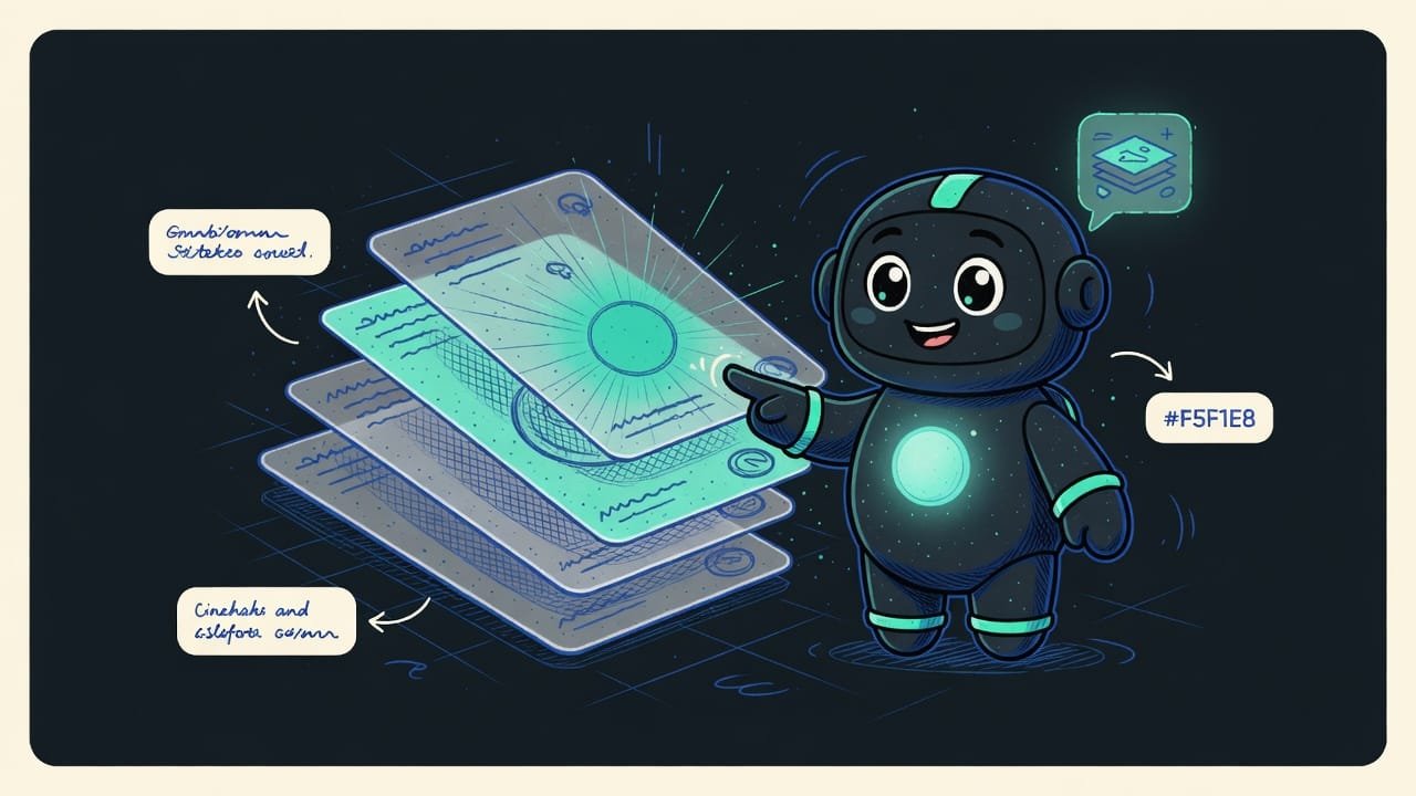
To keep it from getting confusing, picture the background as a stack of films: a dense base at the bottom, each layer above more transparent and thinner. Here’s a calm but living recipe for a dark page.
- Base. Skip pure black - go for a warm dark shade: petrol, graphite, deep blue. Pure black looks cheap and flat.
- Glow. Add one soft radial blob in the top corner, in a color from your accent palette. Feather it so that by the opposite edge it fully melts into the base.
- Second source (optional). If the screen is big and empty, toss a second blob into the bottom corner - a different shade and weaker than the first.
- Grain. Lay a barely visible layer of noise on top. The goal is to remove the plastic look, not to make sandpaper. If you can see the grain right away, dial it back.
- Motion (optional). Make the glow drift very slowly, with a cycle of tens of seconds. And don’t forget a static version for anyone who turned animation off.
And here’s that same recipe, but now as a brief for an AI - so you don’t have to explain ‘make it prettier’ with hand gestures and can name the layers in words instead.
Make a living background for a dark page. The base - not pure black, but a warm dark shade (petrol, graphite, or deep blue). Over it - one soft radial glow from the top corner in a color from the accent palette, heavily feathered, fully dissolving into the base by the opposite edge. Optionally a second blob in the bottom corner, a different shade and weaker. On top, a barely visible layer of grain to remove the plastic look and hide banding, with no sandpaper effect. The glow may drift very slowly, with a cycle of tens of seconds, and a mandatory static version when ‘reduce motion’ is on. Keep the background quieter than the text: the letters stay contrasty and readable.
Common background mistakes and how to avoid them
- Pure black or white as the base. Flat and cheap. Take a slightly warm or slightly cool shade - and ‘expensive’ shows up instantly.
- A glow like a spotlight. Too bright and sharp, a blob cuts the eye. Feather it harder and set the source in a corner or beyond the edge of the screen.
- A rainbow instead of a palette. Five contrasting colors in one gradient - mud at the seams. Use related shades plus one accent.
- Too many blobs. Overdoing the layers means lag on weaker devices and visual noise. Stay in the four-to-six zone.
- Fast animation. Motion over a couple of seconds is annoying and distracts from reading. Slow it down to tens of seconds per cycle.
- Ignoring ‘reduce motion.’ For some people, animation is physically bad. Always leave a static fallback.
- Grain at the max. If you can see the noise right away, there’s many times more of it than needed. It should only be felt.
- A living background under long text. Transitions and motion under article paragraphs get in the way of reading. Under content, keep the background quieter than in the hero block.
TL;DR - если коротко
- A flat gray background isn't ‘clean.’ It's ‘forgotten.’ A little depth brings the page to life for almost nothing.
- Radial glow - a soft pool of light from a corner. One or two, heavily feathered, is plenty.
- Mesh gradient - several colored blobs layered together. The sweet spot is four to six, no more.
- Motion - just a touch, and very slow. Tens of seconds per cycle. And respect ‘reduce motion.’
- Grain kills the ‘plastic’ look of a gradient and hides banding. Keep it barely there.
- The golden rule: the background always loses to the text on contrast. If it's fighting the letters, you overdid it.