Microanimations and UI transitions: timing, easing, amplitude
Why one interface feels like it answers you and another just twitches
Microanimations and transitions in UI: how timing, easing, and amplitude make an interface feel alive. We break down feedback, elements appearing, and accessibility.
What a microanimation is, in plain terms
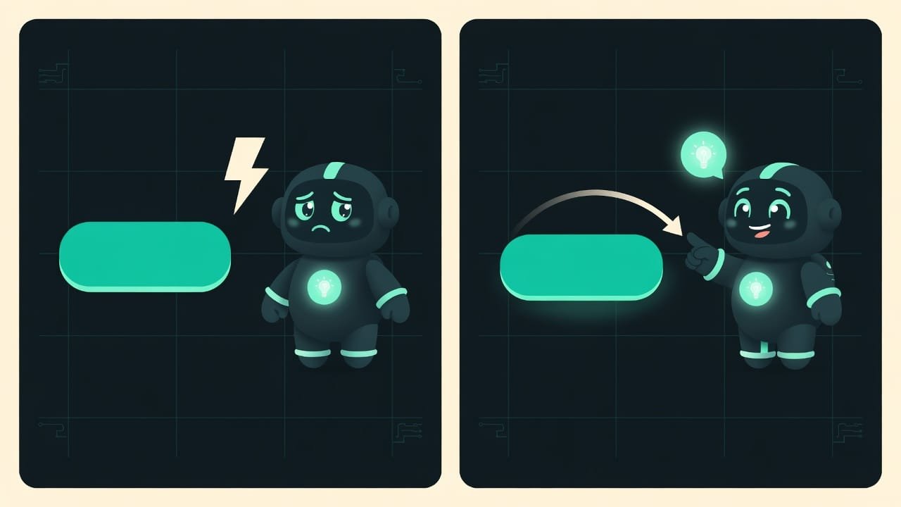
Picture two buttons. The first just changes color — click, done. The second dips slightly under your finger for a fraction of a second, like a real key, then springs smoothly back. Guess which one feels alive? The second. And the difference is literally a couple of tenths of a second of movement. That’s what a microanimation is: a tiny response from the interface to your action.
It’s “micro” because it’s tiny and, on its own, almost unnoticeable. Its job isn’t to show off a trick. Its job is to quietly say: “got it, everything’s on track.” A good microanimation works like a nod from the person you’re talking to. You don’t notice it. But take it away, and the conversation feels dead.
Let’s clear up two words people constantly mix up. A microanimation is a response to an action: a tap, a hover, a toggle. A transition is the smooth shift from one state to another: a menu sliding out, a card expanding. They follow the same logic, so we keep them in one lesson.
Why interfaces need animation at all
You can build an interface with no movement whatsoever — and it’ll work. But it’ll feel cheap and jittery: did it register the tap? Did it load? Where did that card go? Animation fills those gaps almost for free.
- Feedback. Movement confirms the action worked. Without it, people press the button a second time — just in case.
- Clear navigation. A menu slides in instead of snapping into place, and the brain immediately sees where it came from and where it’ll go back to. Abrupt jumps disorient.
- A sense of quality. Smooth responses read as “made with care.” Same logic as an expensive-feeling button, just in motion.
- A clear brief for the AI. Instead of “make it lively somehow,” you say: “a short hover with a slight lift and smooth easing.” That’s exactly the difference between a beginner and someone who sees the details.
Nine out of ten annoying animations aren’t “too little movement.” They’re too long, too harsh in their easing, or too big in amplitude. Overdoing it irritates far more than leaving it out entirely.
What a good animation is made of: three building blocks
Every microanimation rests on three things. The effect itself is secondary. These three parameters are what decide it.
Animation timing — how long it lasts
One word rules here: short. The interface should keep up with the person, not make them wait. A small response — a tap, a hover — is very quick, around a tenth of a second. A bigger transition — a panel sliding out, a card expanding — is a bit longer, but still in the region of a third of a second.
The logic is simple: the farther an element travels across the screen, the slightly longer the movement can last. But once an animation crosses half a second on an ordinary action, the interface feels slow and sticky. Even if it’s technically fast.
Easing — how an animation speeds up and slows down
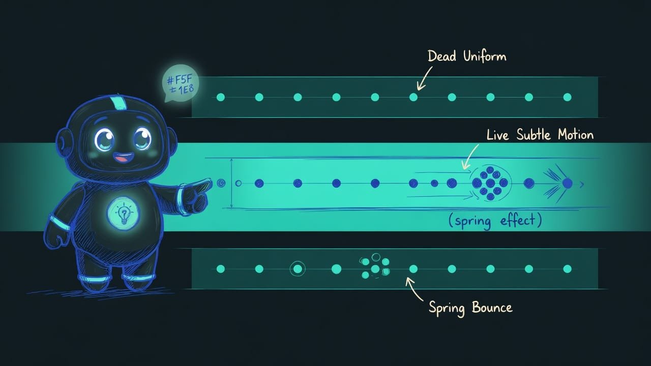
The most underrated parameter. Easing Easing (the acceleration curve) is the rule by which an animation’s speed changes over time. Linear easing is uniform movement from start to finish. “Ease-out” starts fast and slows smoothly toward the end — that’s the one that usually feels most natural in interfaces. is about whether an element moves uniformly or in a lifelike way: accelerating and decelerating.
In the real world, nothing starts or stops instantly. A car accelerates. A ball slows down. Linear, even animation breaks that intuition and instantly reads as “cheap, machine-made.” Movement that takes off quickly and brakes gently toward the end feels natural. That’s the one you want almost every time.
- A fast start and a gentle stop at the end — the element seems to coast to a halt rather than drop.
- Short duration: the eye catches the movement but doesn’t get bored.
- Slightly different easing on entrance versus exit — livelier than a mirror copy.
- Uniform (linear) movement — like an animation out of an old slide deck.
- An abrupt stop at the end — the element seems to slam into a wall.
- A springy bounce on everything — wow once, then distracting and annoying.
Animation amplitude — how far the element moves
The third building block is the range of movement. And here, again, restraint rules. A button lifts a couple of pixels, an icon nudges, a card grows a touch — that’s enough for the eye to catch the response.
The trouble starts when you crank the amplitude to the max: elements fly halfway across the screen, jump, bounce. The first time — wow. The third — annoying. The tenth — you want to turn it off. A microanimation is micro for a reason: it should be seen, not heard.
Where microanimations belong — and where they don’t
Not everything needs to come alive. Animate where movement explains something, and leave alone what’s already clear.
- Button and link states. Hover and press — the classics. A slight lift, a color change, a growing shadow. This is the first thing that makes an interface feel responsive.
- Appearing and disappearing. Toasts, modals, dropdowns, tooltips. Let them slide in and fade out rather than blinking abruptly — then it’s clear where they came from and where they go.
- Toggles and checkboxes. A switch rolls over smoothly, a checkbox briefly draws its checkmark — a tiny but satisfying moment of confirmation.
- Loading and waiting. Skeleton placeholders and smooth indicators say “working, hold on” far better than a frozen screen.
- Switching sections or screens. A soft transition helps the brain understand that one thing replaced another, instead of teleporting.
Example: bringing a button and a modal to life
Let’s build the response from the same three blocks — timing, easing, amplitude — and spell it all out in words, so you can hand it to an AI.
Add microanimations to the button. On hover, it lifts slightly and brightens a touch, and the shadow grows softly. On press, it dips a couple of pixels and the shadow shrinks, as if a physical key were being pushed in. The responses are short, around a tenth of a second. Easing is a fast start and a gentle stop at the end — no linear motion and no abrupt halt. Amplitude is small, the movement barely noticeable. Provide a calm, motion-free variant for the “reduce motion” mode.
Make the modal appear smoothly. The dimmed backdrop fades in softly, while the window itself floats up a little from below and grows slightly to full size. Duration is around a third of a second on the way in and noticeably faster on close. Easing with a gentle stop at the end, no springy bounce. No blinking and no abrupt jumps. For the “reduce motion” mode, the window simply appears with no shift and no scaling.
Common mistakes in microanimations
- Too long. An animation of half a second or more turns a snappy page into a sticky one. Shorten it.
- Linear easing. Uniform movement with no acceleration or braking gives off a “machine” vibe and looks cheap. Add a gentle stop at the end.
- Huge amplitude. Elements fly halfway across the screen and jump around. It’s visible, but exhausting. Micro means just a little.
- Animating everything. When every little thing twitches, the main point gets lost and your eyes start to swim. Animate only what explains the action.
- A blink instead of a transition. A menu or modal snaps into place — the brain doesn’t have time to grasp where it came from. Let it slide in and glide out.
- Disappearing slower than appearing. Waiting for something to lazily crawl off the screen is agonizing. Remove elements faster than you show them.
- Ignoring “reduce motion.” For some people, animation is physical discomfort. Always leave a calm fallback.
- A spring bounce everywhere. Striking once, infuriating by the tenth time. Save the spring for rare accents, not every button.
TL;DR - если коротко
- A microanimation is a tiny movement in response to an action. Its job is to say “I heard you”, not to put on a show.
- What matters isn’t what moves, but how. Timing and easing matter more than the effect itself.
- Keep timing short. A small response lands in about a tenth of a second, a bigger transition around a third. Any longer and the interface feels sticky.
- Easing is what makes it alive. Movement speeds up and slows down. Uniform motion instantly screams “machine.”
- Keep the amplitude small. A button lifts a little, an icon nudges. Big leaps get annoying by the third time.
- Respect “reduce motion”: for some people, animation is real physical discomfort. Always keep a calm fallback.