What You Need to Publish an App: Icon, Screenshots, Copy
Icon, screenshots, copy - the little kit the store won't even let you in the door without
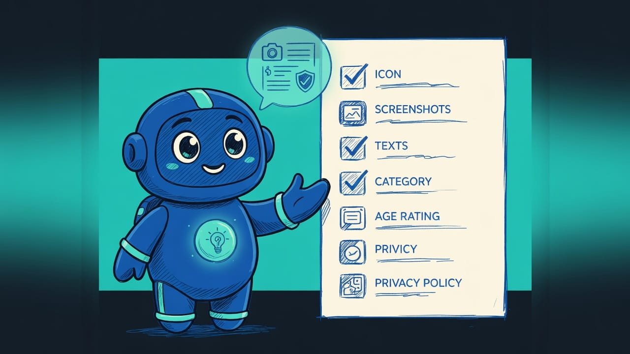
The full asset checklist for publishing an app on the App Store and Google Play: icon, screenshots for different screens, name, description, category, age rating, and privacy policy.
What publishing assets are, in plain words
Your app is built. Feels like there’s one button left and it’s in the store. Spoiler: nope. A store isn’t a USB stick you copy a file onto. It’s a store. With a storefront, a price tag, and an “18+” sign on the door.
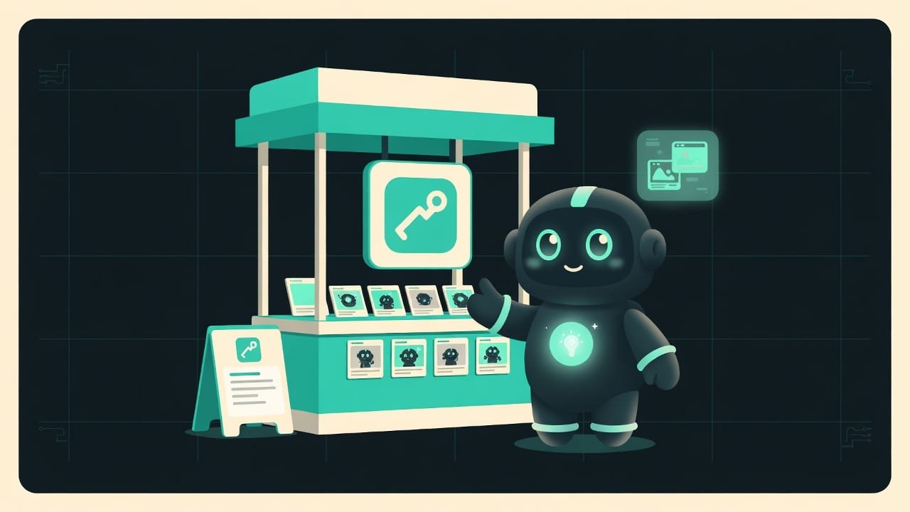
Picture setting up a stall at a market. Your code is the product, but the shopper can’t actually see it. What they see is the sign (the icon), the product photos (screenshots), the price tag with a few words (name and description), and the shelf you’re standing on (the category). Missing even one of those, and the bouncer at the door (moderation) turns you right back around.
This lesson is about your asset kit. What to pack ahead of time so you’re not running in circles on launch day.
Why prep your assets early
The “I’ll throw the assets together at the last minute” logic sounds reasonable right up until the day it bites you. And then it’s a week of dead air: screenshots are the wrong size, there’s no privacy policy page, the description won’t fit the limit. And that’s it - now you wait.
- You’ll know what to prep ahead of time - back during development, not in a panic the day before the deadline.
- You’ll understand why screenshots do more selling than the description: they’re seen first, and they decide whether someone downloads you or scrolls past.
- You won’t trip over the formal blockers. No privacy policy or age rating, and the “Submit” button stays inactive.
- You’ll build one checklist for both stores, instead of assembling the same thing twice.
“Rejected for no reason” almost always means rejected for a reason. An empty field, a broken privacy link, screenshots for the wrong screen. It’s not bad luck and it’s not nitpicking. It’s a line you skipped on the checklist.
The base asset kit for App Store and Google Play
Let’s go through the kit item by item. This is the minimum both stores will ask for - no exceptions.
App icon: your face in the crowd
The icon An icon (app icon) is the small square logo image for your app. People see it in the store listing, on the home screen, and in search results. It's the first thing that catches the eye. is your face among hundreds of others in a list. And it has to read at a tiny size. A simple symbol, a high-contrast background, no small text that’s just going to turn into mush.
Prep it as a large square with room to spare (1024 by 1024 pixels usually works) - the store will cut the sizes it needs itself. No text on top. No transparent edges. And don’t round the corners by hand - that only confuses the system, which adds the rounding for you.
App screenshots: your top salesperson
These are the storefront product photos. People see them before the description and decide in a second: scroll past or install. So a screenshot isn’t “what the screen looks like”, it’s “why you need this app”. A subtle difference that decides everything.
And the most important part - different screen sizes. Phones and tablets show the image differently, so the store asks for separate sets. At minimum, a phone set. If you support tablets, prep one for those too. How many? Usually anywhere from a couple to eight per screen type.
Name and description: the price tag with words
There are three text fields here, and each one has its own hard character limit - and the limit differs between stores:
- Short name - the app's brand. The field is narrow, anything extra gets cut off with an ellipsis.
- Short description or subtitle - one hook of a phrase: what it is and why. People see it right in the listing.
- Full description - the detailed text on the app page. This is where features and benefits belong.
- Stuffing the name with a list of keywords - that's spam, and moderation doesn't like it.
- Writing the description for the algorithm instead of the human - real people are the ones reading it.
- Forgetting the limits - the text just gets cut off mid-word, and there you go.
App category: which shelf you stand on
A category A category is the section of the store your app lands in: “Finance”, “Games”, “Education”, “Health”, and so on. It helps people find you through the right section. is your shelf in the store. Pick the one where people will actually look for you. Put yourself in the wrong place and you’ll end up among strangers, lost in the noise. There’s usually a primary category, and sometimes you can add a second.
Age rating: you don’t set it, you answer for it
A common misconception: “I’ll just set it to 4+ myself”. You won’t. You fill out a questionnaire - does the app contain violence, gambling, profanity, adult content? And the store calculates the age rating itself, based on your answers.
Privacy policy: the link they won’t release you without
A privacy policy A privacy policy is a page that explains, in plain words, what user data the app collects, why, and who it shares it with. Stores require a link to it almost every time. is not a file, but a live web page at a public link. The store literally checks that the link opens. A broken or empty page is one of the most common reasons for rejection.
And yes, even if the app “doesn’t collect anything at all”, you almost always need the page. You’re using third-party libraries, analytics, or account sign-in - and that’s already data. You can put together a simple text with a free policy generator and host it at any public address.
How the App Store and Google Play differ in the details
The base is shared, but each store has a couple of quirks of its own. And the details are exactly where people trip.
- Google Play additionally asks for a wide feature graphic for the storefront - a horizontal image above the screenshots. Apple has no such field.
- The App Store lets you add a short preview video alongside the screenshots, and it often noticeably boosts conversion.
- Character limits for the name and descriptions differ. Don’t count on the same text fitting both fields untouched - it won’t.
Asset checklist before publishing your app
Run through these points before you hit “Submit”. Works for both the App Store and Google Play.
- Icon as a large square with room to spare, no text and no transparent edges.
- Screenshots for phone. If you support tablets, a separate tablet set.
- The first two screenshots show the main benefit, not the settings screen.
- Short name - the brand, fits the narrow field.
- Short description - one hook of a phrase: what it is and why.
- Full description - features and benefits, no keyword spam.
- The right category chosen, where people will look for you.
- Age rating questionnaire completed, answers honest.
- Privacy policy hosted at a public URL, the link opens.
- For Google Play, a wide feature graphic also prepared.
Common beginner mistakes when publishing
- Thinking publishing = upload the code. The store needs a storefront. No icon, screenshots, or copy, and the submit button won’t even click.
- One screenshot set for all screens. Phones and tablets ask for different sizes. Guess wrong and you’ll get a rejection or a mangled store listing.
- Bare screen screenshots. They sell poorly. Add a caption with a benefit, especially on the first two.
- No privacy policy or a broken link. One of the top reasons for rejection. Check that the URL actually opens.
- Setting the age rating yourself. You only answer the questionnaire - the store does the calculating. And lying on it is dangerous.
- A description for the algorithm, not the human. A wall of keywords looks like spam and scares off real readers.
- Prepping assets at the last minute. The surest way to blow a deadline over something silly, like the wrong image size.
TL;DR - если коротко
- Publishing isn't a case of “upload the code and go grab a coffee”. The store needs a storefront: icon, screenshots, copy. Without them, the “Submit” button stays greyed out.
- One kit, two stores. Icon, screenshots, name, description, category, age rating, privacy policy - put it together once, submit to both the App Store and Google Play.
- Screenshots do more selling than any copy. People see them first and decide in a second: install or keep scrolling.
- You need screenshots for every screen size. One set for both phone and tablet won't fly.
- A privacy policy is a working link, not a file. A broken or empty URL is the number-one reason for rejection.
- You don't pick your age rating. You answer a questionnaire honestly - the store calculates it for you.