Website Animations: The Kind That Help, Not Annoy
When motion is care for the user, and when it's a twitching Christmas tree
Why a website needs animations, which ones actually help, and which ones annoy and slow things down. Duration, smoothness, accessibility — and how to ask AI to get motion right.
What good animation is, in plain words
Picture this: you walk into someone’s home, and instead of saying hi, the host starts jumping around, shining a flashlight in your face, and tossing confetti. Fun? For about five seconds. Then you want to leave.
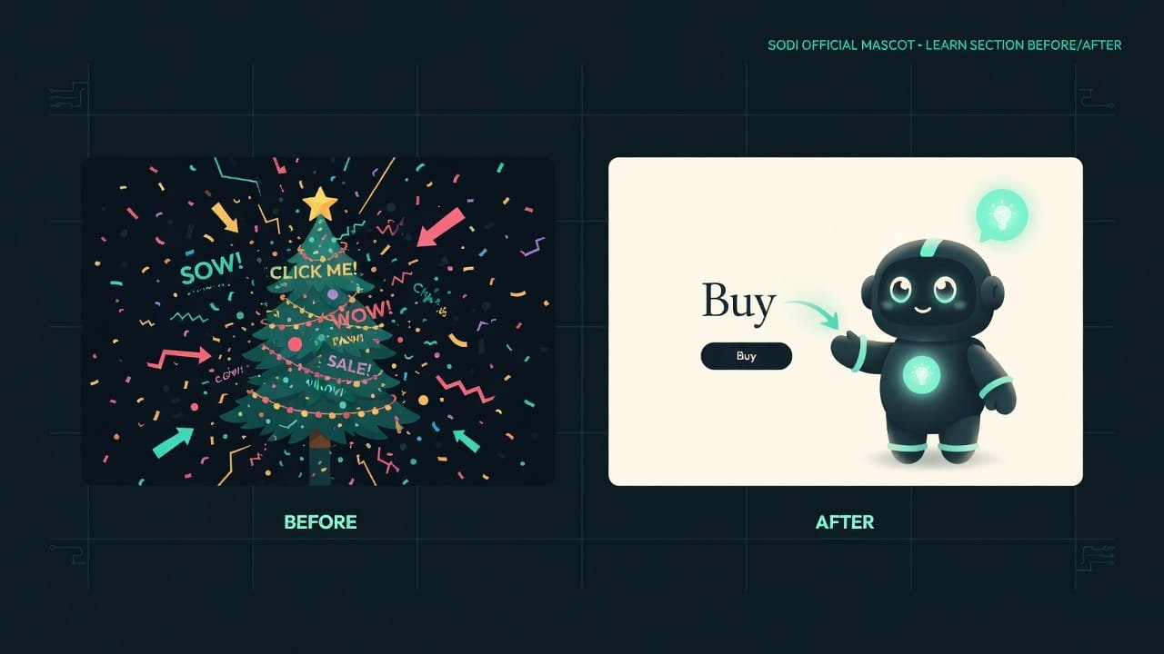
That’s exactly how most animations on beginner sites work. Buttons spin. Text flies in with a delay. The background shimmers like a Christmas tree with way too many strings of lights plugged in. The person came to learn something or buy something — and they’re being force-fed entertainment.
Good animation behaves differently. It’s a polite butler: it doesn’t fuss about, but at the right moment it gives a small nod — “tap here,” “one sec, loading,” “done.” You barely notice it. But take it away, and things suddenly feel off.
Why a vibecoder needs to understand animations
You’re a vibecoder. You don’t draw animations by hand — you ask AI. And here’s the catch. If you don’t understand which motion helps and which gets in the way, AI will default to piling on “wow effects.” There are a million of them online, and it’s seen them all. The site gets worse — and you won’t even know why.
When the basics live in your head, you:
- get a site that looks expensive, not like a landing page from 2008;
- don’t scare people off with stutter and lag;
- tell AI specifically: “animation is needed here, but drop it over there”;
- don’t anger the people who genuinely get dizzy from motion on screen.
One rule covers 90% of the questions: motion should either lead the eye, or explain what’s happening, or preserve the link between screens. If it does none of the three — cut it.
Four rules of good interface animation
This is the distilled version of a professional animation system for websites. The rules are simple. That’s exactly why they get broken most often.
1. Animation has to communicate something
Good motion always has a job. And there are exactly three jobs:
- Leads the eye. The “Buy” button appears — it slides in gently so you notice it.
- Explains a state. A spinner spins — “loading, hang on.” A checkmark bounces — “success.” A field shakes red — “error.”
- Preserves the link. A window didn’t pop out of nowhere; it grew out of the button you clicked — and your brain understands it’s the same thing.
Does none of the three? It’s decoration. Cut it without mercy.
2. The faster the animation, the better
A beginner’s favorite mistake: “I’ll make it slower so you can see how pretty it is.” Nope. People expect a reaction right away. The brain reads slow motion not as “pretty” but as “lagging.”
3. Animate opacity and position, not size
This part is pure technique, but even a vibecoder has to get it. The browser moves two things easily and smoothly: opacity Opacity — how visible an element is: from 0 (invisible) to 1 (fully visible). Changing it is cheap and smooth — easy for the browser. and shift and scale Shift and scale (transform) — moving an element and resizing it visually, without recalculating the whole page. The browser does this very cheaply. .
But changing actual sizes — width, height — or “left/top” coordinates is heavy. Because of that the browser recalculates the entire page from scratch, and the picture stutters.
4. Respect the people motion makes seasick
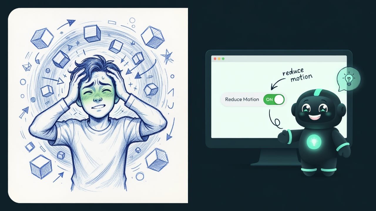
This isn’t a minor thing or a box to tick. Some people genuinely get dizzy and queasy from motion on screen — it’s vestibular sensitivity. On their devices — phone and computer alike — they’ve turned on the reduce-motion setting.
A good site sees that and, in this mode, turns off the sharp flying-in, leaving only a gentle fade-in. A professional tool does this on its own, and AI can too — but only if you ask. It won’t figure it out by itself.
Helpful animation vs. harmful animation
- A button responds slightly to a press — the user feels the click landed.
- A window fades in smoothly and fades out smoothly, instead of jerking into view.
- A spinner or a loading skeleton honestly says ‘wait, loading.’
- Blocks gently fade in as you scroll — and the eye doesn’t get lost.
- Everything happens fast and respects reduce motion.
- Every element spins and blinks just because it can.
- Text flies in one word at a time — impossible to read, infuriating.
- An endless animation that means nothing and keeps pulling the eye toward it.
- A list slides in one item at a time forever — half a second of waiting per row.
- The site stutters and lags from size animations.
A real-world example: the landing page that annoys
You ask AI: “make a beautiful landing page with animations.” It tries its hardest. Every heading flies in from a different direction. Images spin on hover. Buttons pulse. The background shimmers. The list of services slides in row by row with a long pause.
You open it — and within ten seconds something inside starts to irritate you. On the surface it’s “everything moves, it’s pretty, right?” But it’s irritating because:
- The motion explains nothing — it just exists.
- Everything is too slow — each appearance steals a second from you.
- The list slides in one at a time so slowly you have time to get bored.
- On the phone everything stutters, because sizes are being animated.
And here’s how a vibecoder who read this lesson would ask:
Make animations for the landing page following the rules of good motion, not for the sake of looking pretty.
- Animate only the appearance and position of elements — via opacity and a slight shift. Don’t animate width and height: that makes the site stutter.
- Keep durations short: a button press around 0.15 seconds, blocks appearing around 0.35 seconds. Nothing longer than 0.6 seconds.
- Let buttons respond slightly to hover and press — just a touch, no jumping.
- Blocks fade in gently as you scroll, but make the list appear fast, with no long queue.
- Be sure to respect the system reduce-motion setting: in that mode, leave only the gentle fade-in, with no flying around.
- Every animation must mean something: loading, success, error, or a transition. If the motion explains nothing — don’t add it.
Checklist: where animation fits and where it’s excess
Not sure whether motion belongs here? Run it through the checklist:
- Is it a reaction to an action? A press, a hover, a form submission — yes, a light animation fits.
- Is it a state change? Loading, success, error, a window opening — yes, motion helps you understand what happened.
- Is it a transition between screens? A window growing from a button, a page smoothly changing — yes, it preserves the link.
- Is it just “to have something wiggle”? No purpose — cut it.
- Does it last longer than a second? It almost certainly needs to be sped up.
Common beginner mistakes with animations
- “Make it prettier with animations.” Too vague — AI will pile on effects. Set boundaries: what, how fast, why.
- Slow “so it’s visible.” To the user, slow motion = lag. Keep it at 0.15-0.35 seconds.
- Animating sizes. Width and height stutter. Move opacity and position.
- Endless animations with no meaning. Constant flickering and spinning pull attention apart. An animation has to mean something.
- A list that slides in forever. Rows appearing one after another for too long — that’s infuriating. Keep the delay between them tiny.
- Forgetting about reduce motion. Your flying-around genuinely makes some people feel sick. Always ask AI to account for it.
- Animating everything in sight. When every element moves, attention latches onto nothing. Less is better.
TL;DR - если коротко
- Animation isn't decoration, it's the language of the interface: motion tells the user that something is loading, that it worked, or that a window opened.
- Good motion always has a job — lead the eye, explain a state, or keep the link between screens. Does nothing? Toss it.
- Fast = good. A working animation runs 0.15-0.35 seconds. Longer than a second and people read it as the site lagging.
- Animate opacity and position (transform/opacity), not width and height — otherwise the picture stutters.
- Some people get dizzy from motion. There's a reduce-motion setting, and AI knows how to respect it — if you ask.
- “Make it pretty” plus animations equals a disco. Set the boundaries — what moves, how fast, why — and you get an interface.