Liquid glass: iOS 26 glassy buttons, ordered with a prompt
A button like a drop of water on glass - and how to order it in plain words
Liquid glass from iOS 26 explained simply: what a glass button is actually made of, and how to ask an AI agent for these translucent buttons and panels without trial and error.
What liquid glass is, in plain words
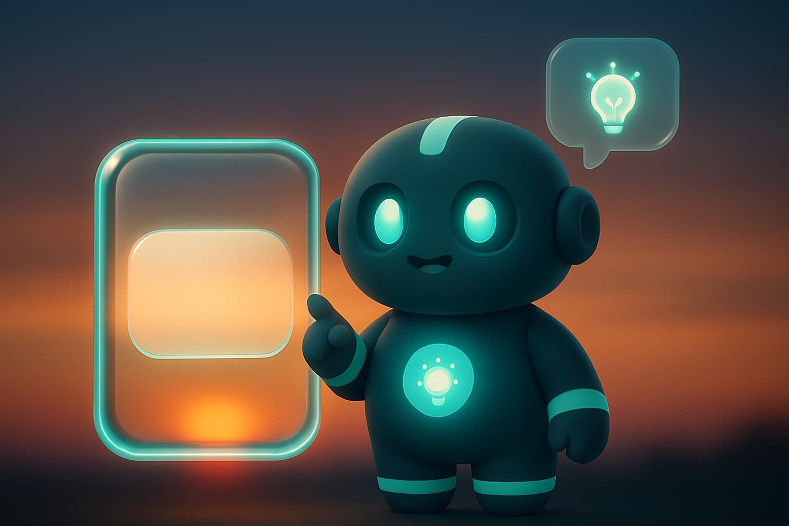
Take a piece of frosted glass and lay it over your favorite photo. You can still see the photo behind it - but blurred, soft, like through a fogged-up window. A thin highlight runs along the edge. Tap it with your finger and the glass comes a little alive. That’s liquid glass - the signature look of buttons and panels in iOS 26.
A button stops being a flat rectangle with a fill. It becomes a translucent pane of glass with the background breathing through it. Sounds like a small thing. But this is exactly what makes an interface feel so “expensive” and “Apple-like.”
Why a vibecoder needs to understand glass
You’re a vibecoder - you don’t write styles by hand. So why would you even need to know what glass is made of? Here’s why. If you know the recipe, you:
- explain it to your agent in words - and it nails it on the first try, instead of slapping together some murky who-knows-what;
- understand why glass is sometimes invisible (spoiler: it’s all about the background) and how to fix it fast;
- don’t turn your site into “glass hell,” where everything shows through everything and the text is barely readable;
- speak the same language as designers -
liquid glass,frosted,bluraren’t magic, they’re specific words.
“Make some nice buttons” versus “make the buttons in liquid glass style: background blur, a touch of transparency, an edge highlight, corner radius 16” - that’s the difference between a lottery and ordering off a menu.
What glass is made of: four ingredients
Apple calls it a “dynamic material.” Sounds scary. In reality it’s four simple layers stacked on top of each other. Memorize them and you’ll be able to order glass like your morning coffee.
1. Background blur - the heart of the effect
Glass starts with background blur Background blur is the effect where everything BEHIND the button shows up fuzzy and smeared. That’s exactly what makes the button look like frosted glass rather than just a transparent square. . The button isn’t painted a solid color - you can see what’s underneath it, just out of focus. Remove the blur and you get a transparent little square. Add it and suddenly it’s a “frosted window.” This is the most important layer; without it the rest is pointless.
2. Transparency and a faint tint
Glass is a little bit transparent - otherwise the background can’t breathe through it. And you can give it a faint tint A tint is a light coloring of the glass in some hue. Not a solid fill, more like the glass is slightly tinted. You use it to make an important button stand out. : say, color the main button in your brand hue so it stands out from the ordinary ones. iOS even has a separate “enhanced” style for a button like that.
3. The edge highlight - what brings it to life
Real glass always has a bright sliver, a reflection, running along its rim. Without it, the glass is flat and dead. With it, it’s three-dimensional and alive. Seems like nothing. But the difference is huge.
4. A reaction to taps
A good glass button responds to your finger Interactivity means the button reacts to touch and to a mouse hover: it lights up a little, plays with light. It makes the interface feel alive. In iOS this is turned on separately - not every piece of glass should react. : it lights up a touch, plays with light under your tap. But there’s a catch. This reaction isn’t given to everything - only to the things people actually press, like buttons and toggles. Nobody touches a decorative glass card, so it doesn’t need a reaction.
Several glass buttons side by side: one container
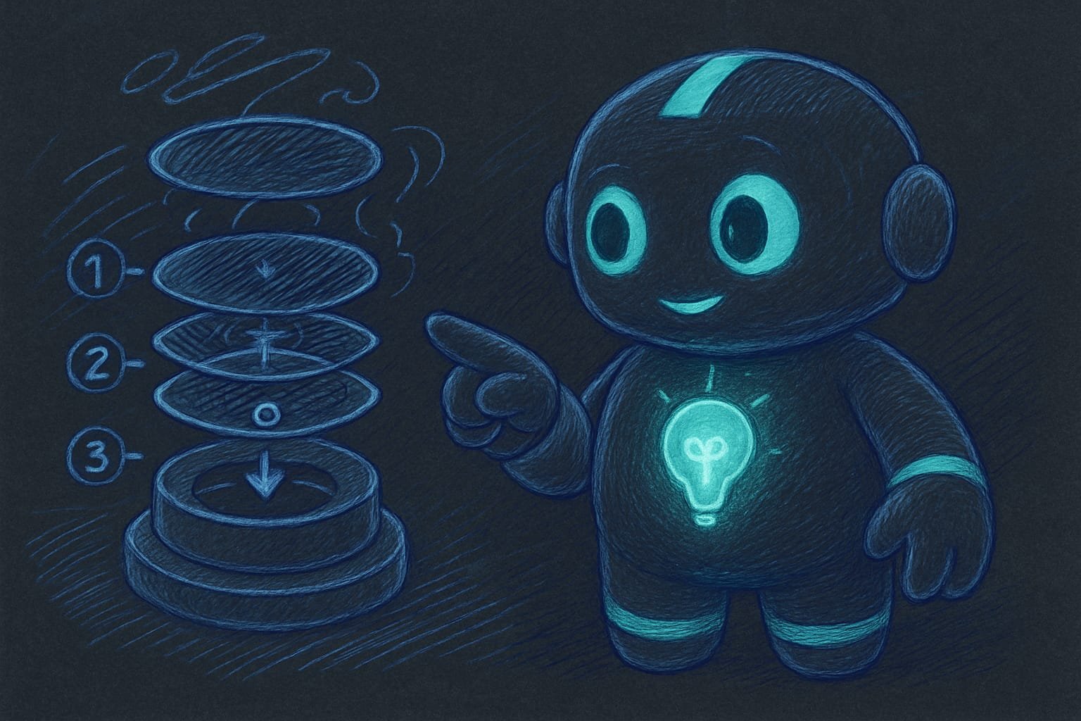
This is where beginners trip up. A single glass button is the easiest thing in the world. But once you put several of them in a row - say, in a bottom bar - a rule appears: put them in one shared container.
Why? Two reasons. First, that way the panes merge nicely at the edges when they sit close together, like drops of water joining into one. Second, it’s faster: drawing a single shared piece of glass over five buttons is easier than drawing five separate ones. Five separate panes mean both lag and a mess on screen.
- Several glass buttons go in one container: they merge at the edges and don’t lag.
- The glass sits over a live background (photo, gradient), not on a plain white sheet.
- The tap reaction is only on buttons, not on every single pane of glass.
- Text on the glass is contrasty and readable on any background, in any theme.
- Five separate panes with no container - it lags and looks dirty.
- Glass on a solid color - zero effect, just a pale square.
- Literally everything is made glassy - your eyes melt.
- An opaque background under the glass - the whole show-through idea is killed on the spot.
Why the glass didn’t work: a walkthrough
You ask your agent: “make me some trendy glass buttons on the site.” It cheerfully slaps together some translucent blocks. You look at the result - and you can’t figure out what’s wrong. Some pale rectangles, no “wow,” and in places the text isn’t even readable.
What went wrong:
- The buttons sit on a white background - there’s nothing to blur, so the glass is invisible.
- There’s no highlight along the edge - the glass is flat and dead.
- Dark text over a dark blurred photo - it blends into mush.
Now look at how to order glass the smart way:
Make glass buttons on the landing page in the iOS liquid glass style. Important:
- The buttons should sit over a live background - a large photo or a vivid gradient,
so there’s something to blur through the glass.
- The glass effect: background blur behind the button, a touch of transparency,
a bright edge highlight, corner radius 16.
- Give the main “Order” button a slight tint in our brand teal,
so it stands out from the ordinary ones.
- Put the buttons in the bottom bar into one shared container,
so they merge nicely at the edges and don’t lag.
- Check the readability of the text on the glass in both light and dark themes.
If the text blends into the background - add contrast.
Common mistakes with glass buttons
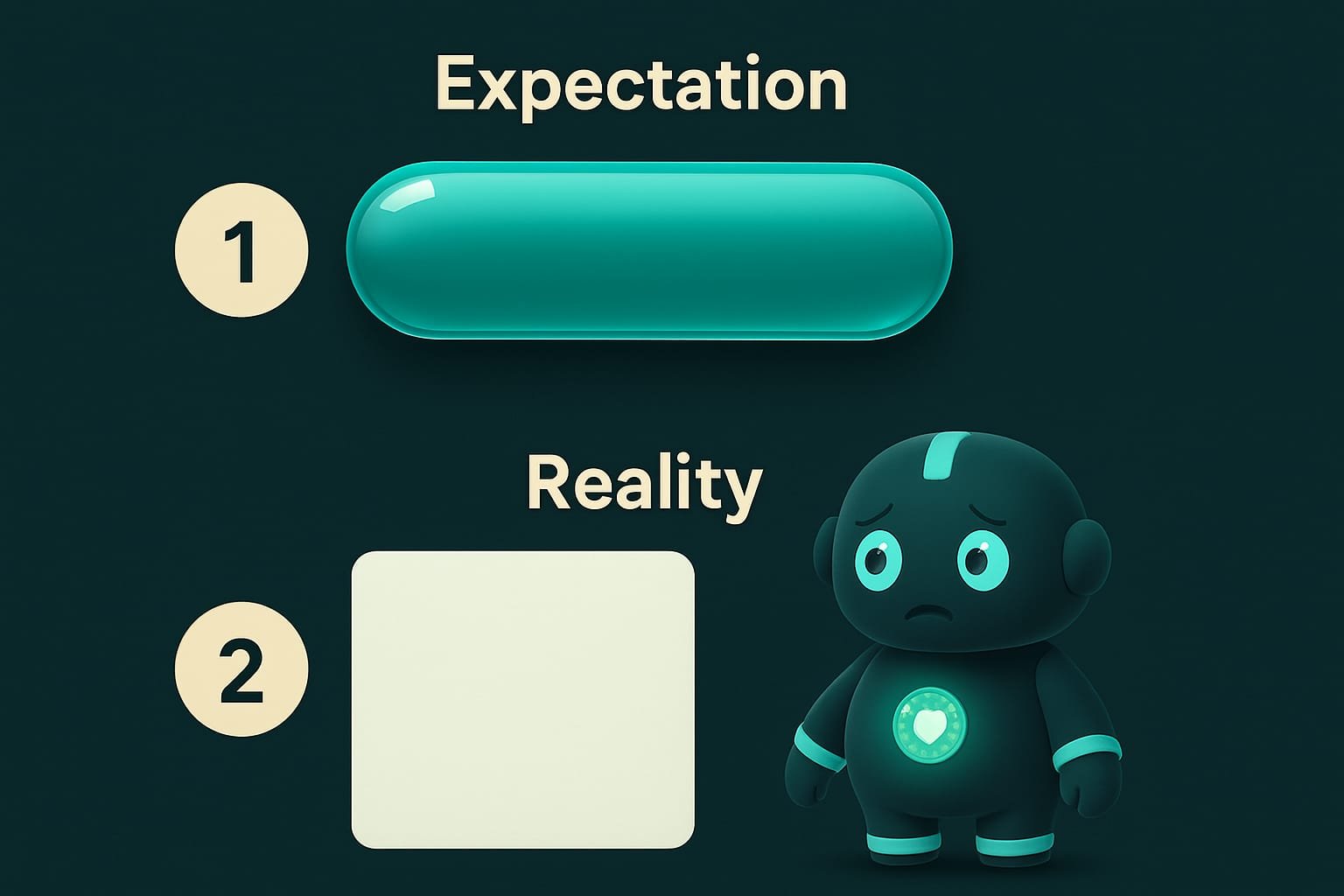
- Glass on a white or solid background. Nothing to blur means no effect. Give it a live background, end of story.
- Making everything glassy. Glass is for buttons, panels, and cards - not for every block and every letter.
- Forgetting the highlight. Without that edge reflection, glass looks flat and cheap. A small thing that makes all the difference.
- Several panes with no container. Lag and mess. Put neighboring panes into one container.
- Ignoring readability. Pretty glass you can’t read the text on is a broken button. Check the contrast in both themes.
- An opaque background under the glass. A solid fill behind the glass, and the whole show-through idea quietly dies.
TL;DR - если коротко
- Liquid glass is a material from iOS 26: a button like a slab of frosted glass with the background breathing softly through it, all blurred.
- Glass = four things: background blur, a touch of transparency, an edge highlight, and a reaction to taps. That’s it.
- No live background, no glass. There’s nothing to blur on a plain white sheet - zero effect.
- Buttons in a row go into one container. Then they merge at the edges and don’t lag.
- You can’t make everything glassy - glass is for buttons and panels, not for every single letter.
- Name the material and the ingredients for your agent - and you’ll get iOS, not a murky pancake.