Design Without the AI Template: Killing That Neuro Site Look
Every AI-built site looks the same. Let's break down how to give yours real character — and do it before you write a single line of code.
Why AI keeps spitting out the same purple sites with giant letters, and how one brief — a design direction — gets you a design with character instead of a template.
What a neuro site is and why you spot it instantly
Picture this: you order a cake and tell the baker exactly one word — “cake.” What do you get? The most average cake on earth. Round, sponge, frosting roses, a “Happy Birthday” scrawl. Not because they have no imagination. Because you gave zero hints about direction — so they handed you the safest possible average.
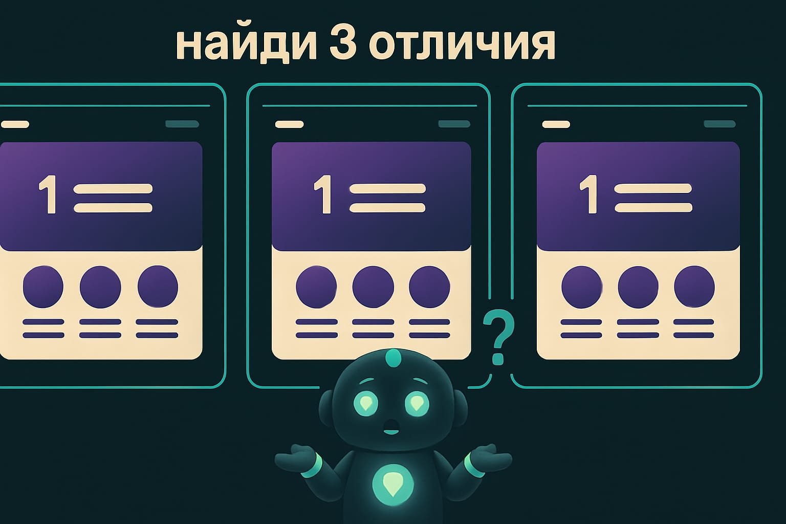
An AI designer works exactly the same way. Tell it “make me a beautiful site” and you’ll get that same cake with the roses. Dark purple gradient. A headline filling half the screen. Murky colored blobs in the background. A stack of identical rounded cards. And filler along the lines of “We’re changing the future.” It’s not even ugly. It’s just exactly what everyone else has.
Why killing the template look matters for a vibecoder
You’re a vibecoder. You don’t draw in Figma pixel by pixel — you set the task, and the AI draws. And here’s the trap: set the task like everyone else, get a site like everyone else. How does that hurt you?
- your project blends into thousands of neuro landing pages and doesn’t grab anyone for even a second;
- an investor, client, or professor reads it in a heartbeat: “ah, some neural net cranked this out in an evening”;
- you burn hours on “no, not like that, try again” fixes — when the real problem was no direction from the very start.
The gap between “a site that reeks of templates” and “a site with character” isn’t talent and isn’t Figma. It’s five decisions made before the first line of code. Let’s get into them.
Design direction: five decisions before the first line of code
Good design doesn’t start with code, or even with color. It starts with a design direction A design direction is the set of decisions about WHAT the interface should be like before you start building it: what it's for, who it's for, in what tone, and what makes it memorable. . Before the agent writes a single line, someone — either the agent itself or you in the prompt — answers five questions. Let’s go.
1. Goal: what job the interface does
A portfolio site, a dashboard you work in daily, and a product landing page are three different universes. A dashboard you stare at every day should be dense, quiet, and easy to scan at a glance. A landing page or promo, on the other hand, has every right to be loud and bright. The biggest fail is stretching “landing-page composition” over a tool people use a hundred times a day.
2. Audience: who’s looking and what they want to see first
Who’s going to run this flow over and over? What should catch their eye in the first second? A design for a teenage gamer and one for an accountant are different designs. Even if the buttons are the same.
3. Tone: pick one word and stick to it
Utilitarian, editorial, playful, industrial, minimal, dense, calm — pick a clear direction and don’t let go. “Just make it pretty” isn’t a tone. It’s the same average cake, just in different words.
4. The memorable detail
One idea that makes the interface feel made on purpose rather than coughed up by a generator. Unusual typography. A signature trick with lines. An unexpected accent color. One single thing a person carries away in their memory.
5. Constraints
Which framework, what the accessibility and performance requirements are, whether there’s already a design system A design system is a project's ready-made set of colors, fonts, buttons, and spacing. If one exists, a new piece should follow it instead of inventing its own style. . If the project already has components and colors — use them, don’t invent a new style on every page. And AI loves doing exactly that, so rein it in explicitly.
Anti-template: the neuro site tells that give the AI away
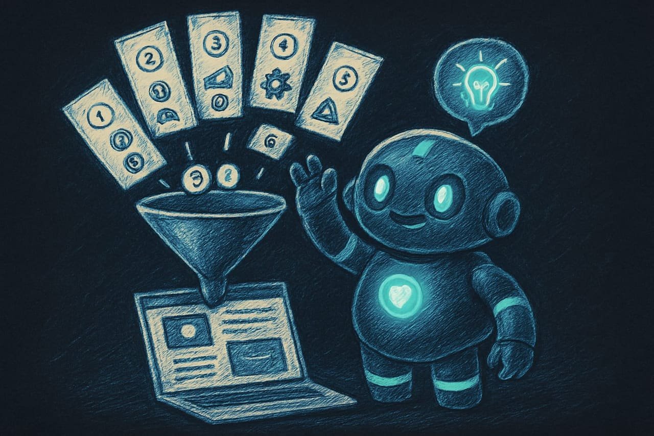
There’s a set of tricks AI drags in out of habit — and they instantly scream “a neural net made this.” Learn them by sight. And ban them right there in the prompt.
- The first screen immediately shows the actual product or tool, not filler.
- The palette is multidimensional: several shades working together, with real contrast.
- Typography fits its container: the headline sits where it belongs, not as a half-screen giant.
- There's one memorable detail the page is recognized by.
- Icons for familiar actions, and motion only where it clarifies a state.
- A purple gradient and murky colored blobs in the background.
- A huge faceless hero headline and filler about “changing the future.”
- Identical bloated cards — and on top of that, a card inside a card.
- The whole screen in one color — the palette collapsed into a single note.
- The product hidden behind marketing sections that retell what you can already see.
A worked example: a timer site before and after the brief
You ask the agent: “make a beautiful site for my timer app.” It hands you a dark purple background, a “Master Your Time” headline filling the whole screen, three identical cards reading “Simple / Fast / Easy” — while the timer itself, tiny and shy, hides somewhere down below. Pretty? Sort of. Recognizable? Not one bit. And the worst part — the very thing the person came for (the timer) got exiled to the basement of the page.
What went wrong? You gave one word, “beautiful” — so the AI handed you the average. It didn’t know the tone, the audience, or that the hero of the page is the timer, not a slogan.
Now watch how a vibecoder who gets it would do this. They put the direction right in the prompt.
Build a site for a timer app. First lock in the design direction, then write the code.
Goal: the main screen is the working timer itself, and it should be visible immediately, no scrolling.
Audience: students who fire up the timer a hundred times a day; they care about speed and calm.
Tone: minimal, calm, slightly editorial. No marketing filler.
Memorable detail: a large clock face with smooth animated progress around the circle.
Constraints: a palette of a few complementary shades, not one color over the whole screen.
Bans: no purple gradients, no decorative blurred blobs in the background, no giant hero headline, no cards inside cards. Don’t describe in words what’s already obvious from the buttons.
Images in design: meaning over stock blobs
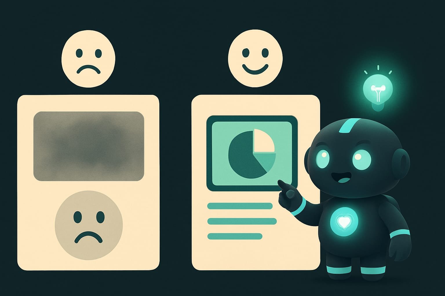
Does your interface lean on images — products, places, people, charts? Then give it real or on-theme generated pictures, not faceless “atmospheric” stock blobs for decoration. An image should carry meaning — not act as a plug for a hole in the layout.
Common mistakes when designing a site with AI
- “Make it pretty” with no direction. A guaranteed average cake. Give it a goal, a tone, and an audience.
- Allowing the purple gradient and blobs. The number-one “this is a neural net” marker. Ban it explicitly and right away.
- A giant hero headline everywhere. Match the type to the block, not so it screams across the whole page.
- Getting stuck on one color. The palette should breathe across several shades with contrast.
- A card inside a card. A classic of the bloated AI layout. One level — that’s enough.
- Hiding the product behind marketing sections. The person came for the tool — show the tool first.
- Shoving in stock blobs instead of meaningful images. An image should carry the theme, not plug a hole.
TL;DR - если коротко
- By default, AI gives you the most average thing possible: purple gradient, half-screen headline, floating blobs. That's not taste — it's a reflex.
- There's one cure — a design direction. Before any code, decide: goal, audience, tone, one memorable detail.
- Your palette should breathe across a few shades. Match the type to the block instead of slapping a giant headline everywhere.
- Build the working screen first — the tool itself. The marketing wall of text around it comes later.
- Use meaningful images, not vague stock blobs jammed in to fill holes.
- Before you ship, run the anti-template checklist: gradients, blobs, cards inside cards, filler in headlines.